The Ecology
Data analytics tools range work with the data architecture fed to them. They require stringent and thorough internal understandings of each KPI, their use across various lines of business and their ability to be shared, in part or in whole, with a variety of stakeholders. When any one of these tenets is unmet, the likelihood that any implementation of a BI solution decreases
The Goal: Find the dissonance amongst the stakeholders in order to keep the client on board. Establish an evaluative framework to help inform the development process and establish UX principles. Develop the dashboards.
Discovering Values and Needs
Dashboards are complex reiterations of generalized data. The client made initial contact in hopes of resolving internal dissonance that threatened to derail the project. As relayed, the “visuals” were bad.
From this vantage point inquiry was made into what constituted “bad” and what feedback was available as a comparative metric. None existed as the anecdotes were relayed several months after they were first stated. This served as poor rationale for potentially ineffective and costly redevelopment.
It became clear after the kickoff meeting that the barriers as stated were being prompted by deeper concerns for information clarity and that a simple changing of color schemes and button placement would have no effect.
Mental Models
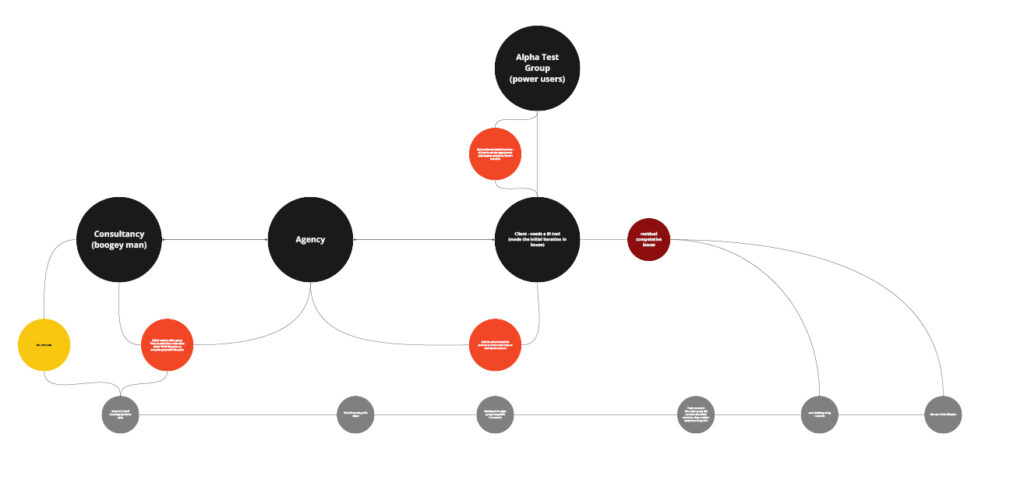
Any mental model is a subjective perspective. Yet, in and of themselves they are wayfinding mechanisms that inform us as to how we think and do within a given context. In order to understand what value might be added to the existing conversation a mental model was formed.
“Everybody hates the current solution and nobody is going to use it.”
Kickoff
Clear from conversations in the project kickoff phase were the presence of assumptions and the relative persuasion those assumptions held over both the project and the relationships of those working on and around the project.
Establishing a RAW framework
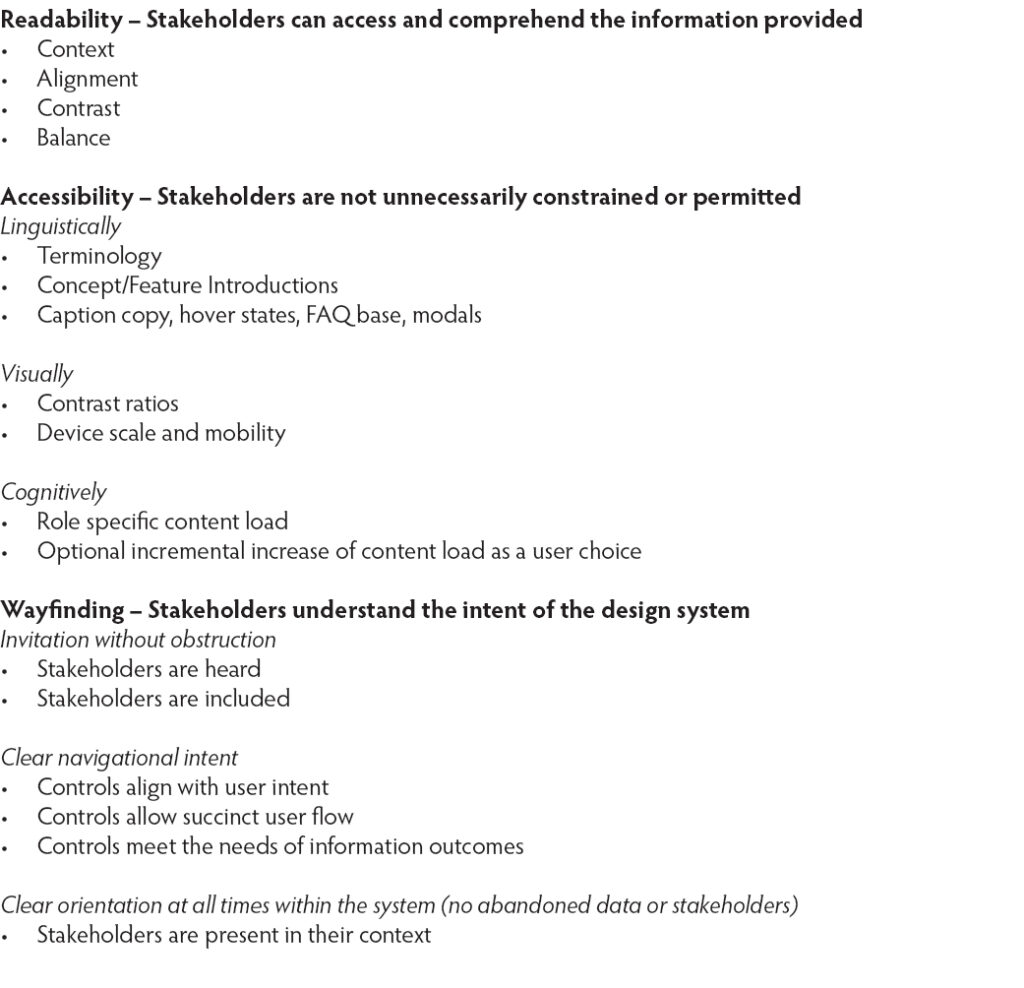
The existing and available feedback surrounding the project was, at best, fraught with emotion. Rather than incorporate a common usability evaluation like the System Usability Scale (SUS), a custom framework was developed to encourage nuance in response. While likert-type surveys prove useful for existing systems the nature of its questions would most likely generate little qualitative value. A readability, accessibility, wayfinding (RAW) framework was developed to quickly get to the root of user feedback woes.
Readability – Invitation/Input
Accessibility – Inclusion/Interaction
Wayfinding – Integration/Intellection
RAW as a framework was derived from The Experience Engine’s triptych evaluation model. Experiences are gauged via intersections and momentums of “input”, “interaction”, and “intellection” to formulate a questionnaire that could more accurately summarize a user’s response to an existing interface. And here, “interface” meaning a thing with which someone interacts for a specific reason. Not simply the common mode of “things we click on a computer”.
Setting the parameters
The global test group was scheduled for a 60 minute moderated feedback session in which the existing interface would be viewed within the context of the RAW framework. Previously, comments were allowed to be open ended and resulted in a deterioration of the direction of the feedback sessions and a degradation of user input. The gorgeous hi-fidelity image shown here is the original RAW model used in the moderated sessions.
Analyzing & Alignment
Clear from the moderated session was the fact that each user was unable to navigate the original interface due to the unclear presentation of the KPIs. Additionally, this system would be employed and required of all business owners. This facet coupled with their inability to understand the information presented created a barrier between the solution in development and their willingness to use it. They could not reconcile why they would have to use something they could not understand when it seemed quite probable that it would negatively affect their daily business operations.
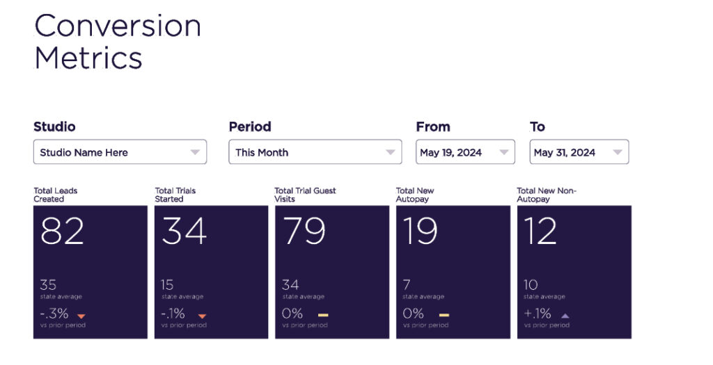
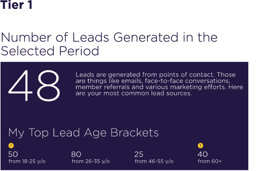
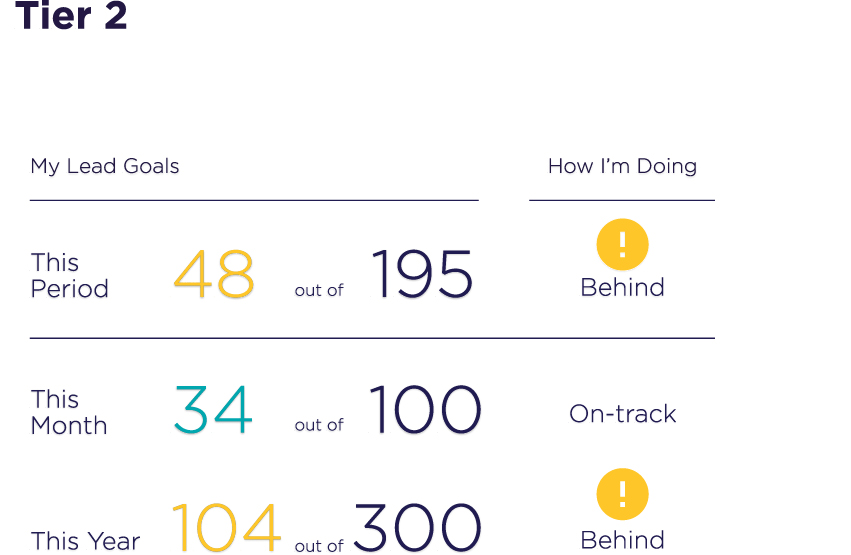
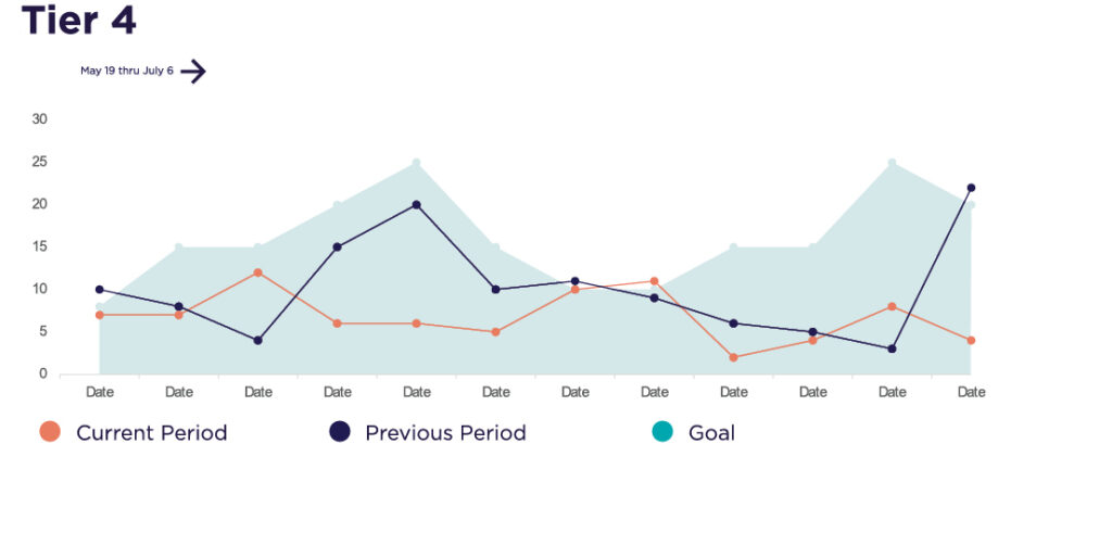
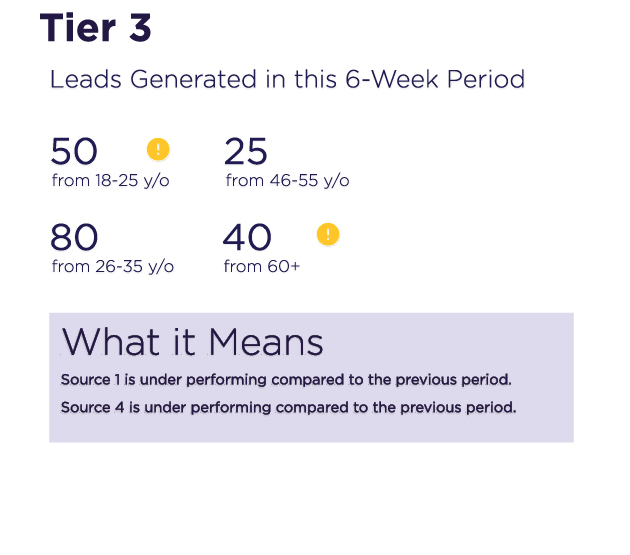
Remediation was needed. 4 Tiers of information narrative were distilled from the feedback sessions:
Primary Level: Currents Trends (with notifications against predetermined baselines or thresholds)
Secondary Level: Trends Over Time (with notifications of dips provide for comparative dips against period)
Tertiary Level: Trends of Change (filtered granularity within metric sets with meta information that details how the granularity relates to a bigger picture)
Quaternary Level: Trend relationships (How do other metrics relate to the currently selected metric? How do external factors such as locational variables, seasonable variables, socio-cultural variables ((national holidays, university schedules, etc.) influence the larger business picture) (why they matter)
These tiers, alongside addendums to the client’s style guide formed the basis for the new design system. (For those unfamiliar with the terminology “design systems” in digital product and branding briefs or style guides are quite similar in nature.) They present similar information for similar reasons.
Synthesis
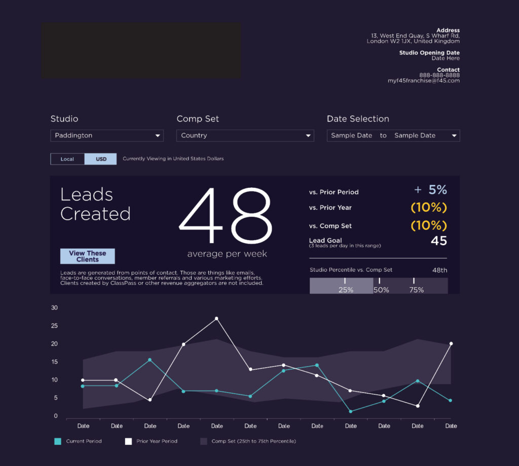
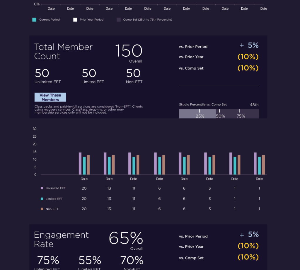
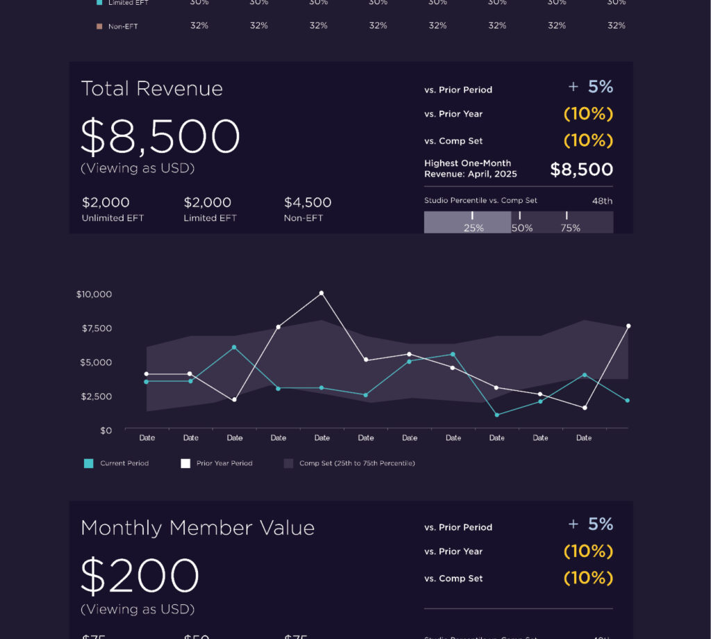
As the users revealed their needs we were able to more accurately reflect upon data presentation and structure. Using the 4-tier system made possible the creation of a series of data narratives, ways for users to navigate complex collections of information so that they might retain the information and, more importantly, understand its effect upon their daily business operations.
Exploring Concepts
Each tier can be evaluated with the following in order:
1. Why does a user/owner need the data?
2. What data do they need?
3. How do they access the data?
4. What does the data enable them to do?
5. What does the data enable them to ask?
6. How does the data help them answer their questions?
7. How does the data inform their results?
Creating and Assuring
The initial re-design of the dashboard was followed by a series of formal reviews with the client’s HQ operations staff and was approved for full development.
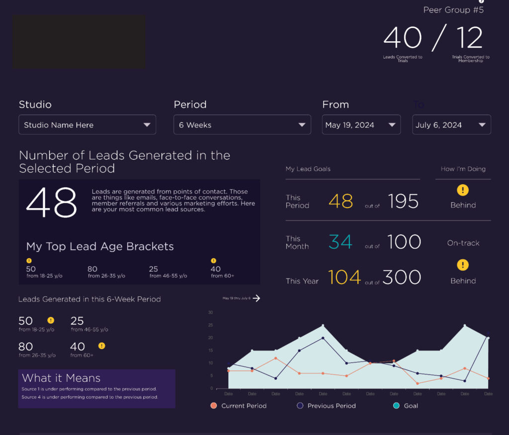
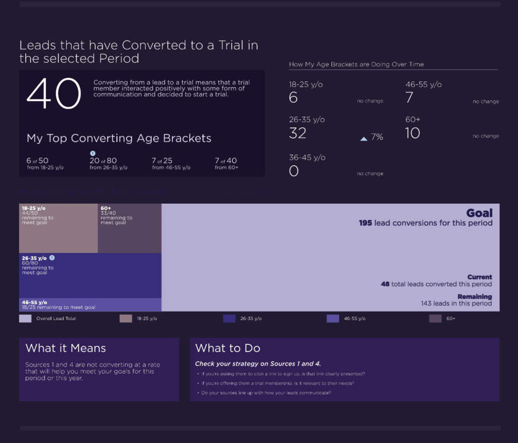
Complexities arose during the following weeks of development and centered primarily upon internal documentation, the clarity of the client’s internal data models, the necessity of some KPIs and the terminology enlisted to encourage the use of the platform by individual business owners.
The end result was a modification of terminology that the client’s HQ felt more comfortable with from an actuarial standpoint. The solution itself, however, remained grounded in the original user-centered research initiative.
The product is now in development.

Sum
Any tool is only as effective as its capacity to be utilized. What began as a strident issue rooted in conflicting opinions regarding visual development was, in actuality, much deeper.
Users could not care about the interface because they could not understand what it was supposed to represent or how it brought value to their businesses or positively affected their means of livelihood. This was a global sentiment.
Through the development of a new user feedback framework, their needs were made clear and the path to product development was cleared of obstruction.
