The Problem Space
Idea sharing platforms are becoming commonplace and global in their scope, outreach and intent to connect users. This asynchronous potential seems, on the surface, to be a valuable asset to teams who would readily need to share information and ideas. However, the effect of language used in Miro’s onboarding procedure encourages cognitive errors that may inhibit possible user bases and limit Miro’s subscription potential.
The Hypothesis: Modifying language on Miro’s current signup screens will increase ease in signup.
This study, a mixed-method approach that includes quantitative and qualitative data, evaluated the response patterns of 6 potential miro.com users using actual (dependent variable) and modified (independent variable) screenshots of the miro.com signup/onboarding process in order to discover any gaps in usability and understanding between users and the current onboarding path provided.
The Goal: Run potential users through a usability test to evaluate the effectiveness of modifications to Miro’s onboarding/signup process.
Discovering Values and Needs
Teams are organizations of people with linked needs. Miro, like other whiteboarding or idea sharing applications boasts the ability to quickly and effectively connect these teams, allowing them to communicate in a shared online space. The tools offered are, frankly, revelatory and eminently useful…for those who understand them and can identify with their use.
For those outside of Miro’s limited taxonomy of teams (marketing, sales, teacher/student, product management, etc.) there still exists a need for a tool like Miro, but Miro’s current onboarding excludes them from a specific category in the sign up process and through the obscurity of the language used, (which is sometimes merely sales conversion driven). Many of the pages create frustration and isolation, factors leading to a lesser degree of willingness to use Miro.
In short, the value of Miro and the needs of users remains. But, the language is getting in the way.
The Approach to Finding Answers
Test Setup
A usability study was designed with six test participants recruited from a single department. The group was identified as well-suited to a sharing platform like Miro due to the nature of their work. Often asynchronous yet highly collaborative and time sensitive. Each participant scheduled a time for testing and post-test interviewing. Each participant had comments regarding both versions and, in support of the hypothesis, were noticeably eased by the second test version.
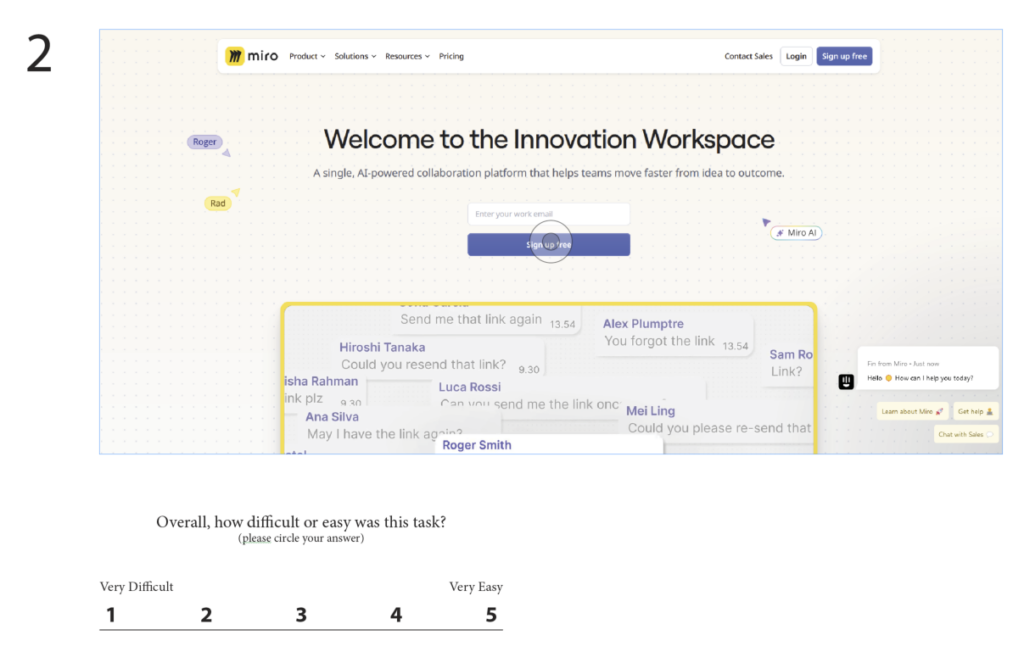
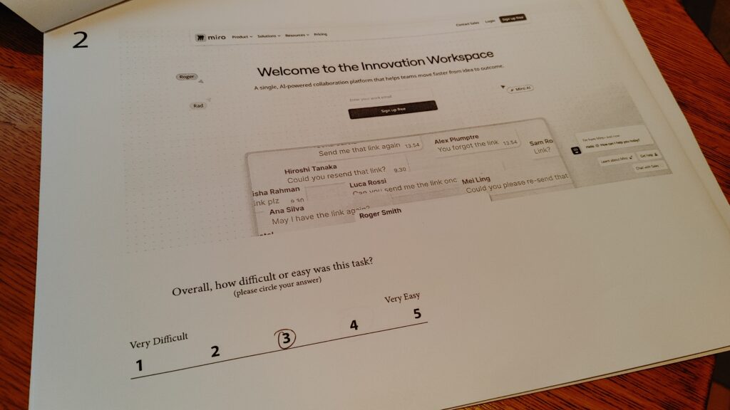
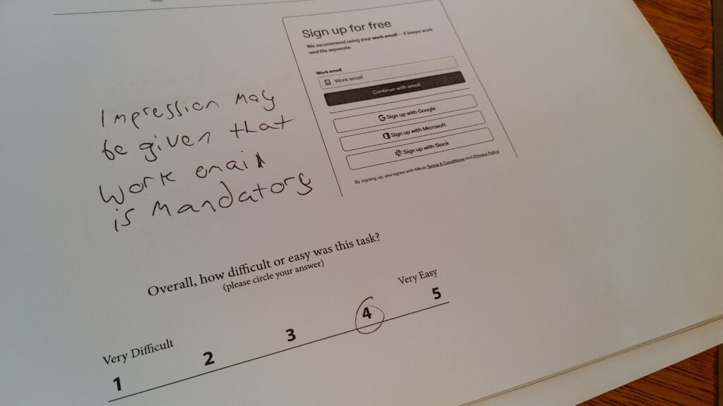
The test itself consisted of a dependent variable group, (Miro’s current signup process) and an independent variable group, (Miro’s current signup process with the language modified on each page) in order to compare which version was easier to complete and more understandable in total. Rather than having participants perform the signup directly within Miro (which would have required them to use two separate email addresses and potentially add to the testing time and incur a lack of focus on the task) screenshots of the signup process were printed and used as test packets. This afforded opportunity for a standard series of metrics to be applied to each page. Done accordingly, the data tells a story.

Metrics
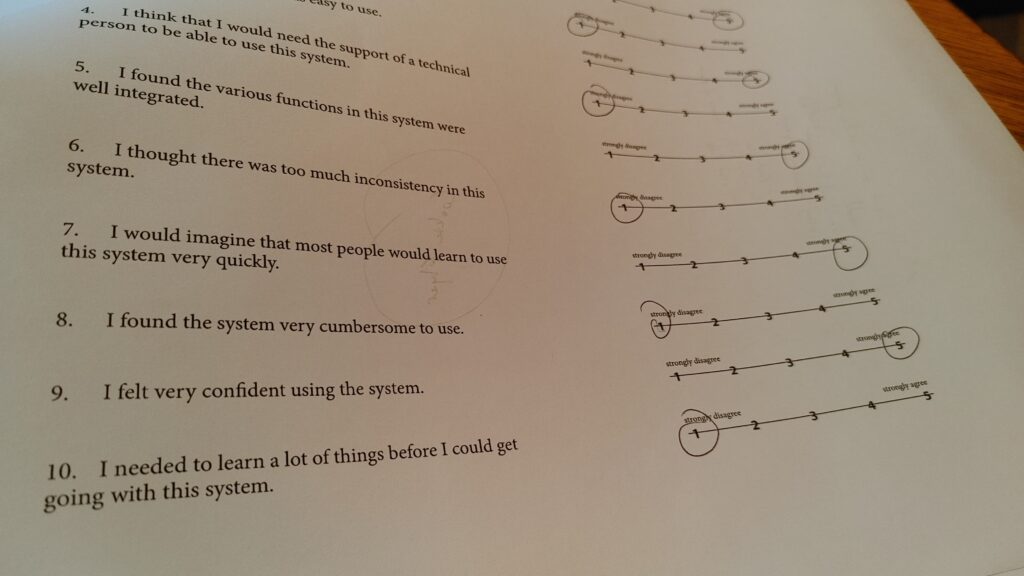
Each page included a single ease question (SEQ) to rank the ease of that page’s specific task from 1-5. The system usability survey (SUS) was included at the end of each test version as a summative approach to each participant’s overall experience. The SUS combined with each SEQ began to form a data narrative that highlighted Miro’s onboarding weak spots. To gain further clarity, participants were briefly interviewed after the test. Their remarks supported the original hypothesis that the language we use matters.
“The clutter on the first page makes it difficult to know what to do.”

A Data Narrative
The story that arose over the course of testing was clear. Miro’s current onboarding process was more confusing, frustrating and difficult than version two. Every measure utilizing the SEQ showed a greater degree of ease with version two, with the lowest average of 4.83 out of 5. The greatest difference occurred with score averages for each test versions’ last page where version one scored 4.16 versus version two’s perfect 5.
The SUS scores showed a greater overall preference for usability of version 2, where the deviation away from ideal scores was 1.12 and 2.4 for pages 1 and 5 respectively. Here participants detailed their struggle with version one as being unclear and difficult to understand.
“Version two was so different. It seemed elementary. There was way less to comprehend what you’re supposed to be doing”.
The quantitative data formed a story arc. With version one, the first and last pages were described as the most confusing. With version two, those same pages with modified language became simple and understandable.

“The description on the last page makes it much easier”.
Answers Found: Feedback Tells Us “Why”.
Beyond the quantitative data were the participants post-test interviews. These helped triangulate “why” usability testing is important as a mixed method. Even though a user may find a specific task easy or difficult, those scores ultimately exist inside their personal context of use. Their feedback could be addressed cognitively as instances of “error” and “attention”.
What test version one tells us about errors in Miro’s current setup
Errors occurred in the form of slips and mistakes. Slips occurred when users had to flip back and forth between pages in order to understand where they had just come from, figure out if they had been presented with the same information twice, and figure out if they had accidentally missed a step. These errors are baked into Miro’s current process.
What test version two tells us about attention in Miro’s modified setup
Where the future state boasted the greatest degree of success was in its explanation of each task, use of accessible language (even though some language blocks were much longer than the current state) and the condensing of form fields into a single page instance as to not detract from the user journey.

Recommendations and Summary.
The Miro onboarding process would be better served through two primary modifications:
- Realign the text prompts on each sign in page with more user-centric language as shown in test version two
- Condense the “tell us about your team” pages (5 in total) into one single page to avoid memory lapse, depersonalization and activation errors
Small Changes, Big Differences
How we say what we say matters. For Miro to increase subscription counts and market share in an age of prolific competition, the need to be concise and user-centered must exist at the core of every presentation of information. Currently, miro.com relies upon language and page presentations that assume a particular user base, unnecessarily excluding potential subscribers. Through simple modifications to each stage of the signup process the exclusions could be lessened, creating viable pathways for greater market share and product use.
Every user has a journey. It is up to those who wish to find them to meet them where they are.
